BloomBud Bouquet App
BloomBud is an app that makes the bouquet ordering process quick, easy and personalized for users.
My Role
UX Designer, UI Designer, Research,
Project Duration
October 2022-January 2023
The Problem
Ordering flowers can be a timely and tedious process.
The Goal
Create a way to quickly, accurately, and enjoyably order flowers for a loved one.
Understanding the User
User Research: Summary
User research revealed issues with navigation and UI, but supported the value of the product idea.
My own assumptions about functionality of the app created some blind spots. The user research pointed these problems out. It quickly became clear that prompts and call to actions must be very bold in order to capture the user’s attention right away. User frustration mounts quickly if navigation is confusing or unexpected.
Users responded positively to the concept of saving preferences within the app for loved ones, and agreed that this function was unique and would save time. Users most often sent bouquets for recurring events such as Mother’s Day and birthdays, so a reminder/recurring event feature was valuable to them.
Pain Points
Time
Users are busy and short on time
Accuracy
The experience of receiving a bouquet is even more joyful when it feels customized to the recipients tastes.
Recurring Events
Many bouquet-gifting events are recurring, such as birthdays and Mother’s Day. A recurring reminder feature & saved preferences would save users the effort of remembering the event on their own.
Meet Diane
Problem Statement
Diane is a busy working mom who needs a quick and easy way to order flowers because she wants to make her loved ones feel special.
User Journey
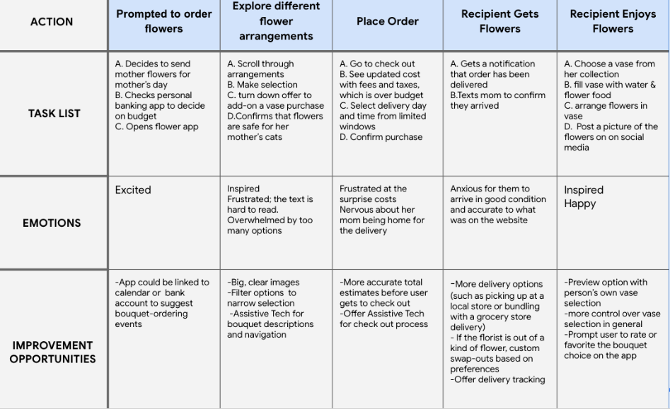
Mapping Diane’s user journey revealed how time consuming and frustrating placing a bouquet order can be. It would be helpful to have features like custom filters, save-able preferences, event reminders and delivery tracking.
User Flow
Competitive Analysis
The largest of these competitors offered an overwhelming amount of filters and options, bogging down the bouquet ordering process and adding surprise fees and costs. The feeling of luxury and customization was important here, since receiving flowers are a special, gifted experience. No floral competitors offered an option to save preferences via bouquet recipient. BoxFox is a hyper - personalized gifting experience with build-able gift boxes. This build-able function felt like a fun experience that wasn’t replicated in the floral sites.
I gathered this information from my own explorations as well as online customer reviews.
Starting The Design
Paper Wire Frames
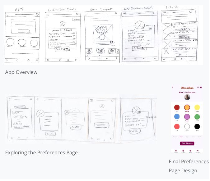
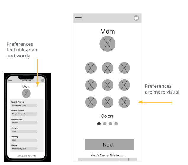
Overall I realized I was trying to design too many features at once and decided to focus on the preferences/”details” page, as research proved this was the most unique and useful element of the app. I did like the large image on the bouquet selection page and began wondering how I could make the app overall more visual and fun to use.
Digital Wireframes
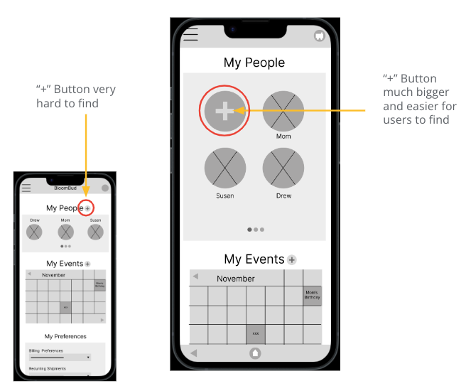
The first round of research revealed that I needed to make several call-to-action buttons much more obvious to the user. Here I took the “new user” button up significantly in size and position so that users would know right away how to add a new recipient. The following research session confirmed this change improved the product.
Digital Wireframes
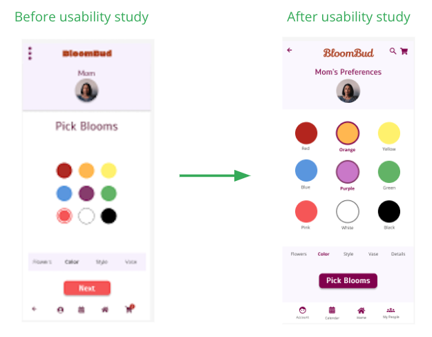
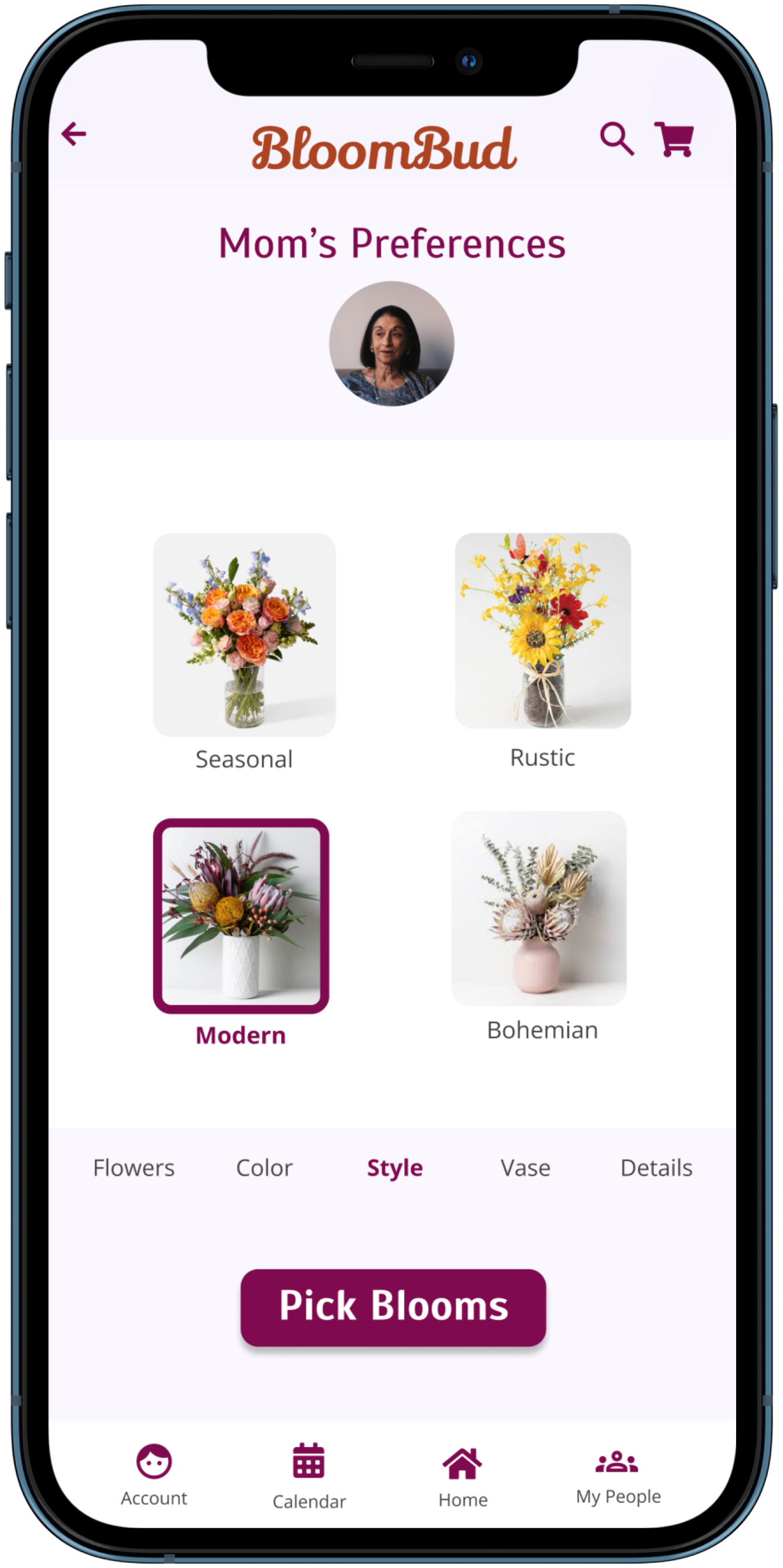
Users were confused about the function of the Preferences page and spent a long time reading the options. They seemed surprised when the bouquet was picked from this page. Updating the page to a series of pages with large images made this part of the app more enjoyable for users, and they felt like they were “building” the bouquet.
Low Fidelity Prototype
The confusion from the research participants revealed that I was trying to design too many features at once. I focused on the preferences page, as research proved this was the most unique and useful element of the app. I did like the large image on the bouquet selection page and began wondering how I could make the app overall more visual and fun to use.
Usability Study Findings
Round One
Users need larger call-to-action buttons
Users need a simple set-up process
The Preferences Page needs more clarity in visual design and in the user flow.
Round Two
The Preferences page must look different from the rest of the user journey.
The preference options need to stand out more visually and have different animation.
The user path should link directly to the bouquet picks from the profile image.
I conducted the first usability study with 5 people. This revealed many usability problems and some conceptual ones. Based on these findings went back to the prototype and did a major overhaul.
Refining The Design
Branding
High Fidelity Prototype
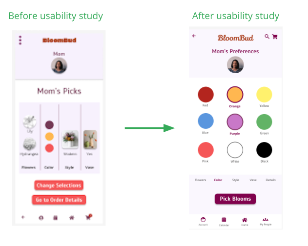
This Preferences Summary page proved very confusing to users.
To solve, I placed the preferences in a single page and eliminated this summary page altogether.
High Fidelity Prototype
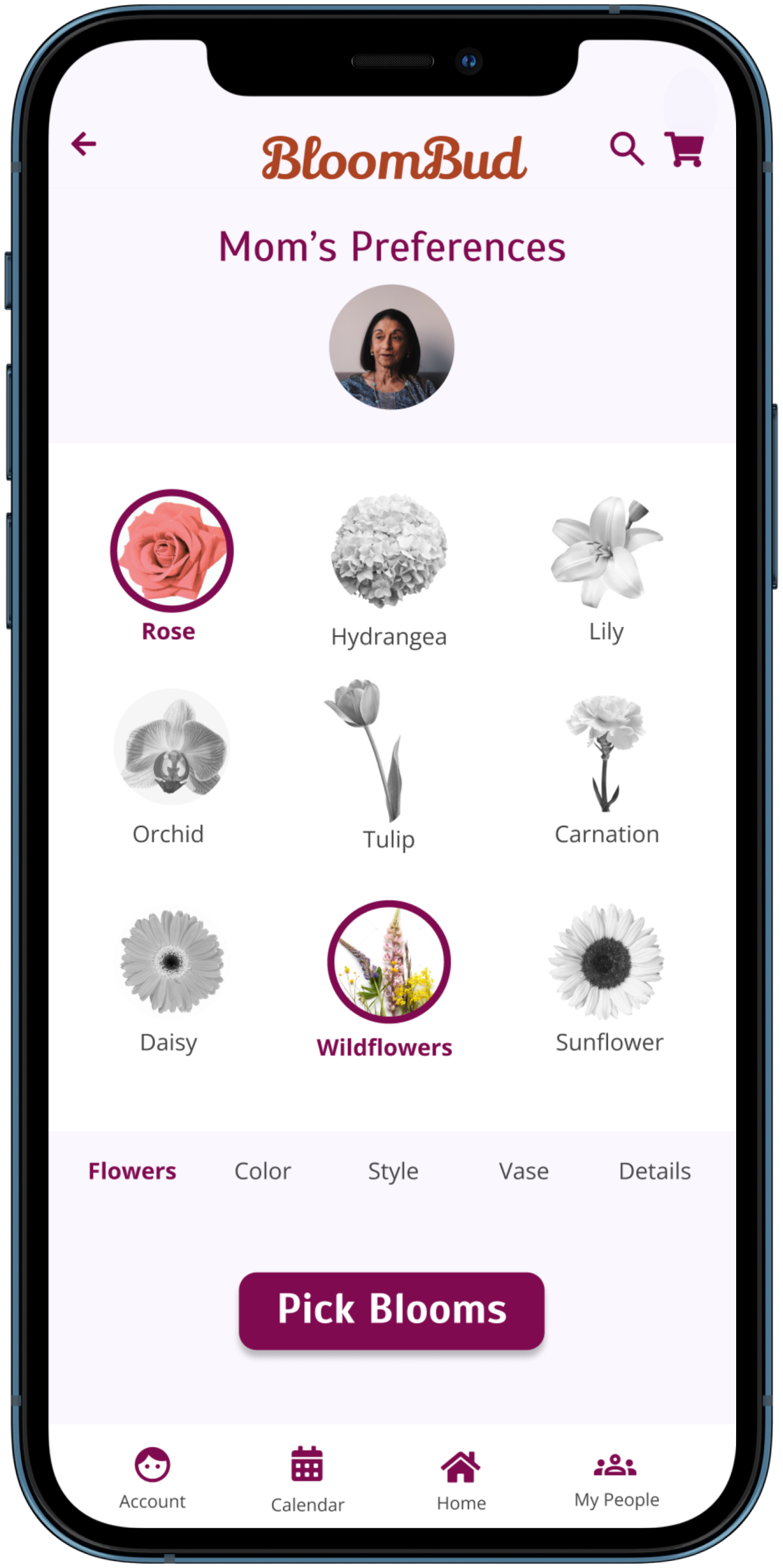
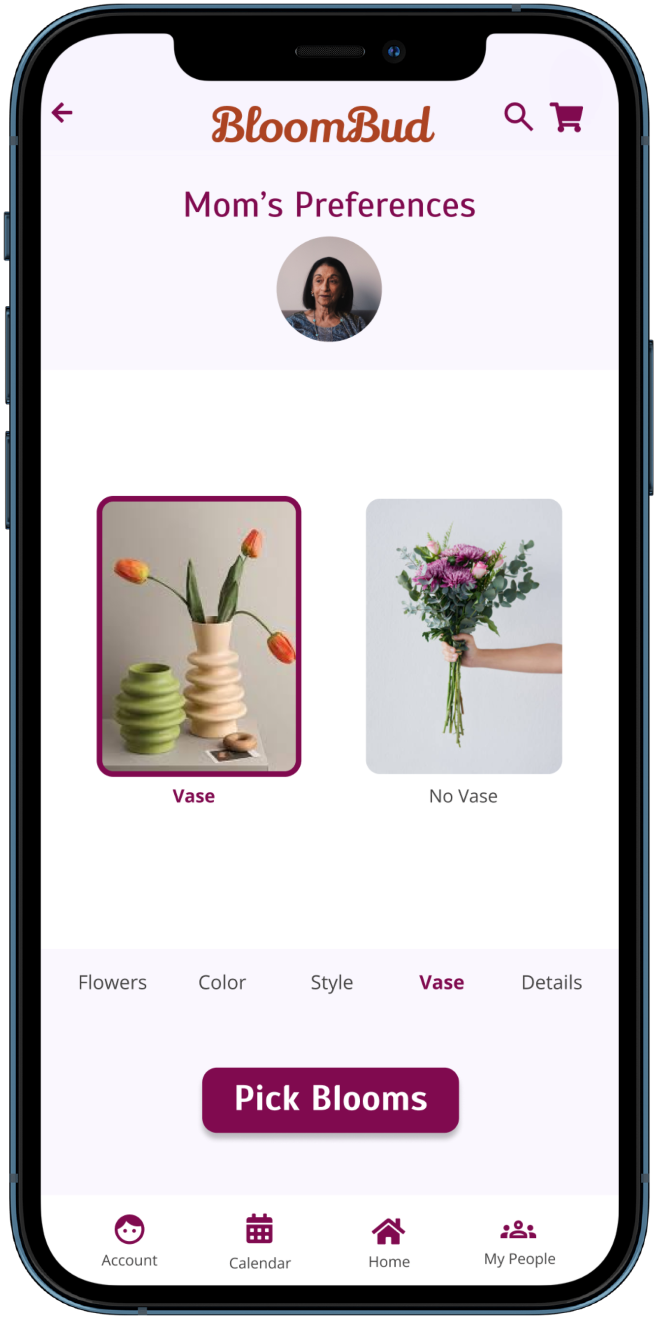
User research revealed that the Preferences page still needed clarity. I made this page visually different from the rest of the app and simplified the color palette to improve UI and direct the user’s eye to the options on the lower part of the screen.
High Fidelity Prototype
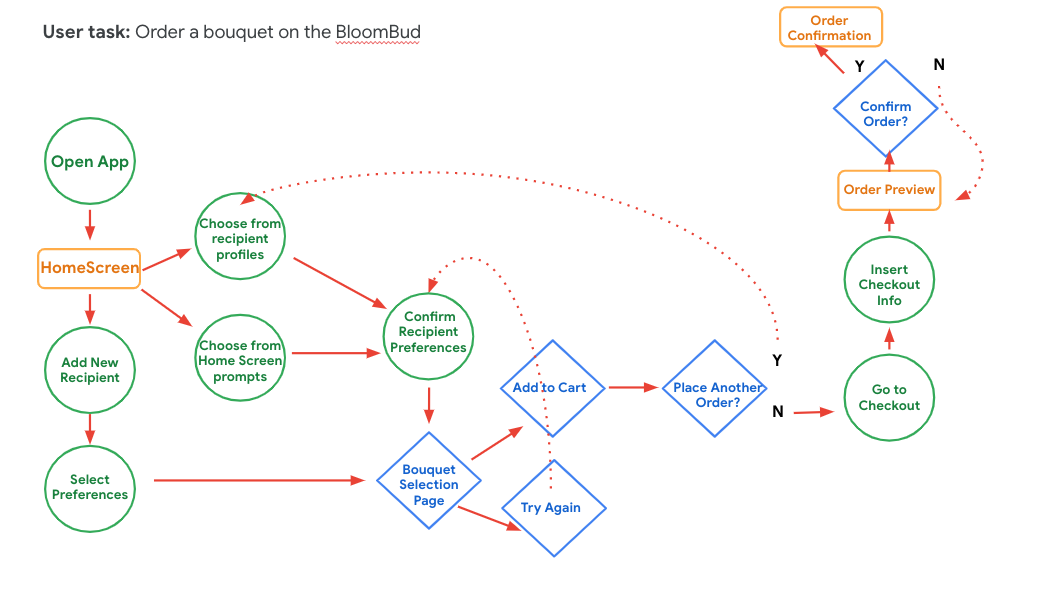
I simplified the user flow by eliminating the preferences summary page and linking directly to the preferences page from the home page. The preferences page now has a different look than the rest of the app and the navigation is more clear for users.
Mockups
Accessibility Considerations
Readability
Confirmed AA readability via the plugin Stark
Screen Reader Compatible
Text beneath the preference option images allows
for screen readers
Universal Imagery
Large Images and iconic navigation
Going Forward
Test User
“I like the idea that I can have all these preferences logged."
Test User
“I would feel very fancy doing it.”
Thank You!
Learnings
What I learned:
I learned just how how iterative the ux design process is, and the value of being able to continue to update products even after they have gone live. As the world changes, user’s needs change and thus the product needs to change.
Next Steps
Another round of usability testing with the revised prototype.
Incorporate P3 learnings about reminders and calendar synching. This was a feature many users were excited about.
Explore how this app could link with local flower shops as well as big-name flower delivery services to offer the users the best options based on their preferences.


